01
Logo Redesign
I redesigned the Sakura logo to infuse it with a fresh, modern look, sustaining its Japanese aesthetic.
I redesigned the Sakura logo to infuse it with a fresh, modern look, sustaining its Japanese aesthetic.
By incorporating sleeker lines and pastel colours, the new design captures the essence of the brand in a more contemporary and dynamic way, ensuring it stands out in today’s competitive market.
In addition to refreshing the main logo, I designed a second variation specifically tailored for the subsidiary, which specializes in wax soy candles. This variation maintains brand cohesion, while subtly adapting to the unique identity of this brand, ensuring consistency and recognition across all facets of the Sakura brand.

Inspired by the timeless elegance of Japanese design, the black porcelain jar embodies the essence of simplicity and refinement. Carefully crafted to maintain a minimalist aesthetic, the placement of the logo on the jar, echoes the harmony and the balance found in traditional Japanese art.
Embracing the essence of Japanese craftmanship, each SAKURA Soy Wax Candle is accompanied by a delicate Kraft paper tag, where the aroma of each candle is handwritten. I have also incorporated to the design, the Japanese characters for the word “aroma”, honoring the rich heritage of Japanese calligraphy.

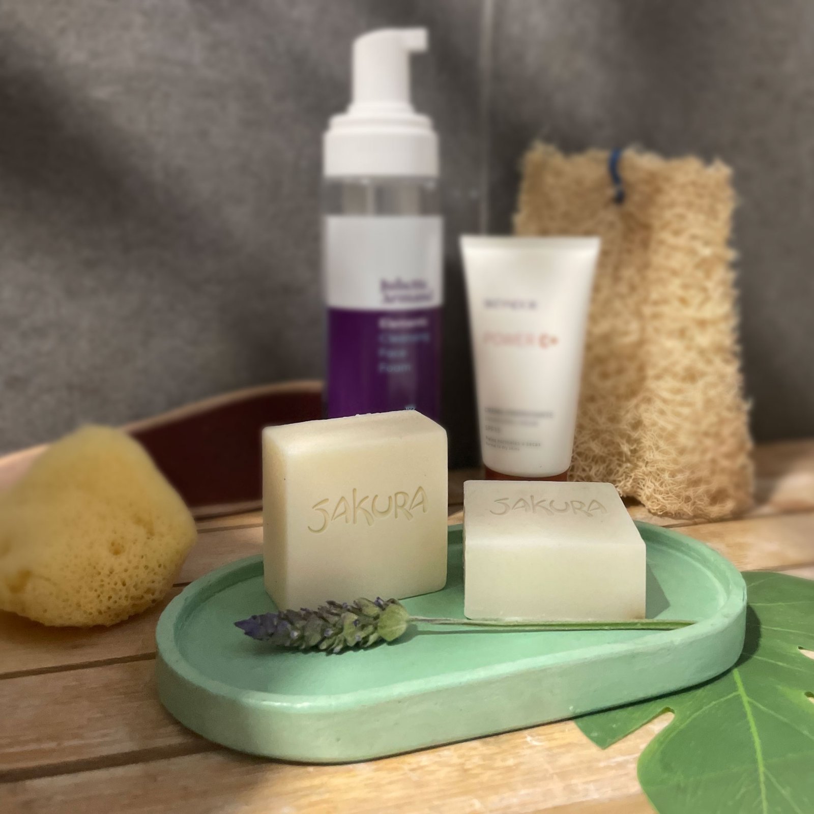
In addition to crafting exquisite wax candles, SAKURA extends its artistry to handcrafted Soaps and porcelain Wardrobe Fresheners. With a keen eye for detail and a passion for aesthetic harmony, my Set Design Photography skill celebrates the essence of purity and elegance, reflecting the soul of SAKURA brand.