01
Branding

In Japanese culture, a Hatsuyume (初夢) is the first dream one has in the new year. Traditionally, the contents of such a dream would foretell the luck of the dreamer in the ensuing year. This concept encapsulates the label’s commitment to artistic innovation and the pursuit of musical dreams.

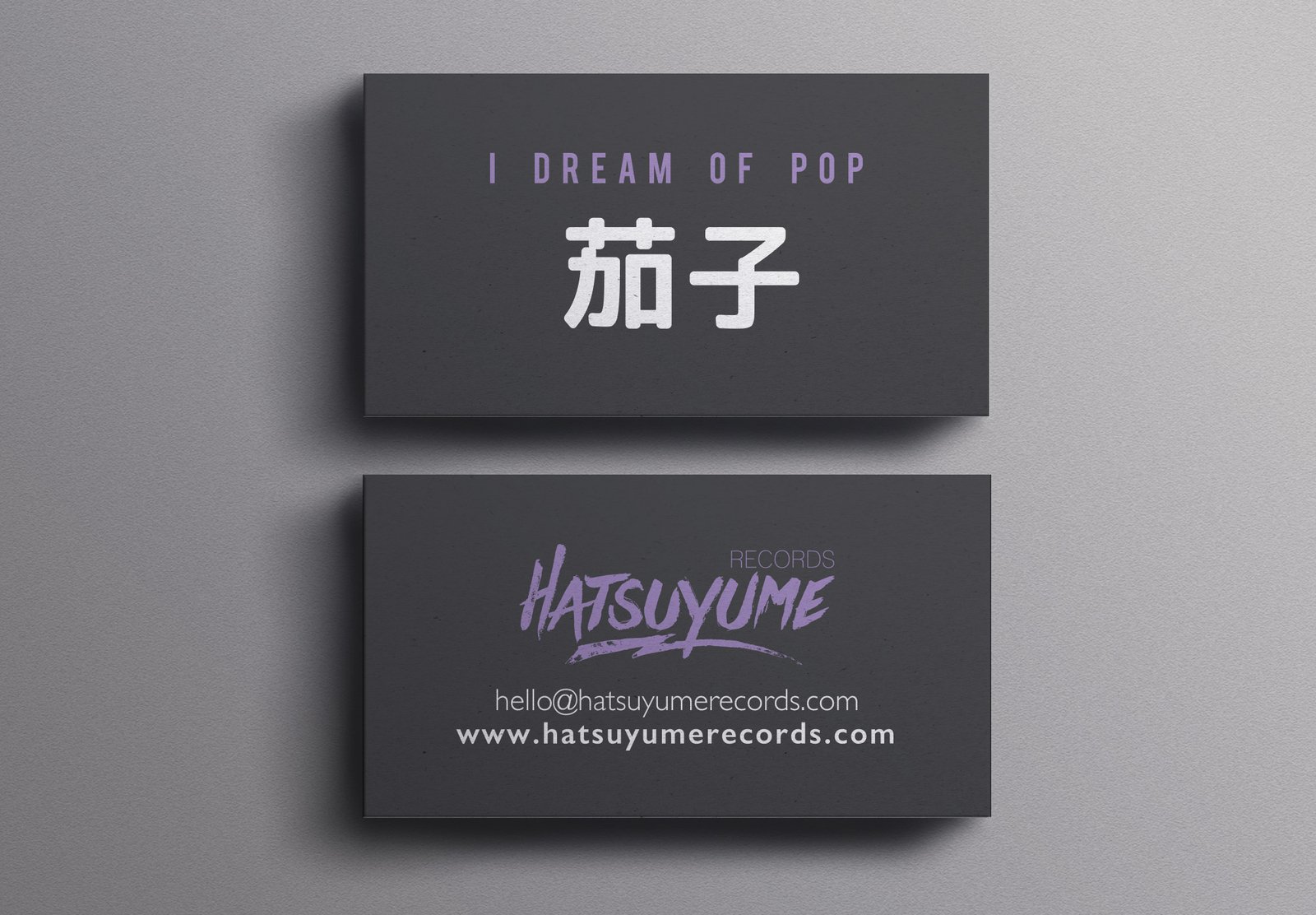
The logo I designed embodies the fluidity and depth of the label’s vision, drawing inspiration from the ebb and flow of the tide. Just as the tide symbolizes constant movement and change, Hatsuyume embraces the ever-evolving landscape of the music industry while staying true to its independent spirit.

The typography reflects the label’s bold and distinct voice, mirroring the unconventional approach it takes in curating and promoting artists. Each curve and line within the logo tells a story of creativity, passion, and the boundless possibilities that lie within the realm of indie music.

Overall, the Hatsuyume logo serves as a visual testament to the label’s dedication to fostering artistic expression and nurturing the dreams of emerging musicians. It is a symbol of resilience, innovation, and the transformative power of music, guiding both artists and listeners on a journey of discovery and inspiration.


02
Card and Slogans

At the heart of the branding lies the slogan “I DREAM OF POP eggplant” (茄子), a whimsical yet profound expression inspired by the Japanese belief in the power of dreams. This phrase not only captures the imagination but also serves as a nod to the three auspicious dreams traditionally considered lucky in Japan: encountering an eggplant, a hawk, or the majestic Mount Fuji.

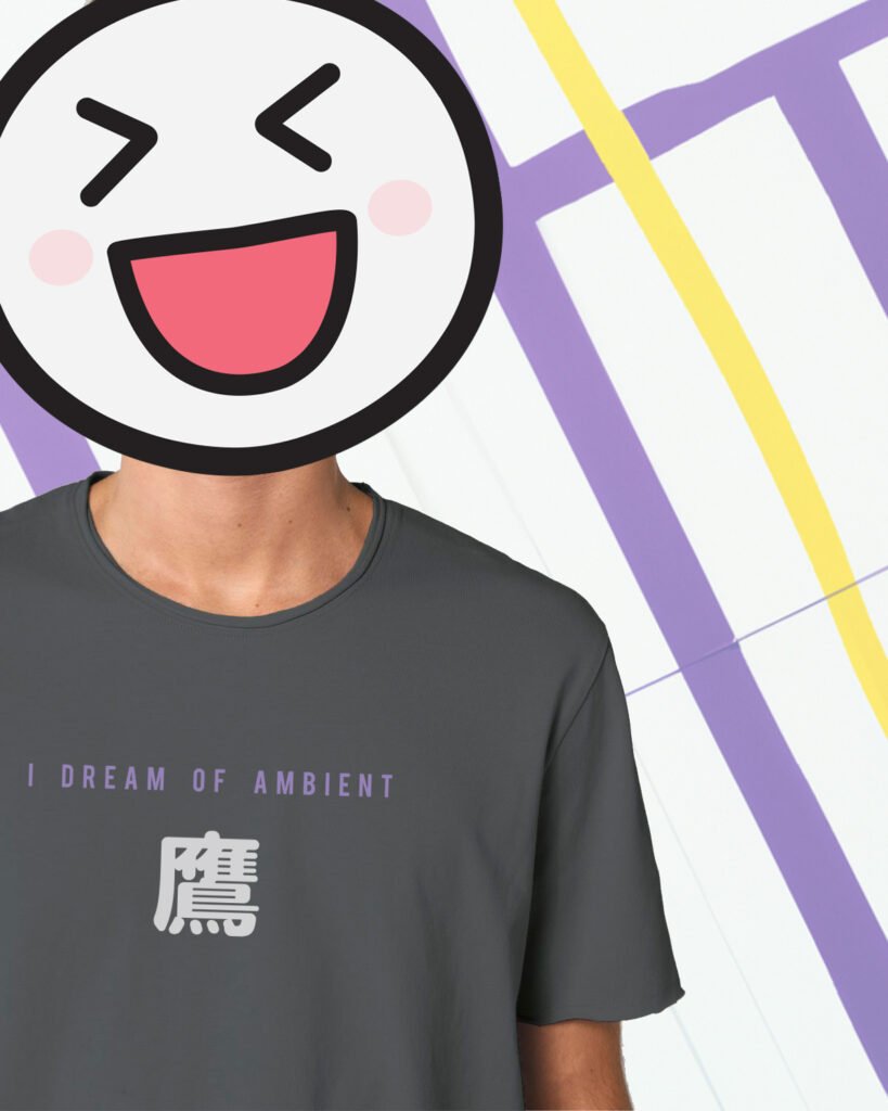
Drawing from these lucky dreams, I crafted two additional slogans, each reflective of different music genres and the ethereal essence of dreams. “I DREAM OF AMBIENT hawk” (鷹) and “I DREAM OF NEW WAVE Mount Fuji” (富士), embody the label’s diverse musical offerings, ranging from Dream Pop and Ambient soundscapes to New Wave experimentation.

Through this dream-inspired branding, Hatsuyume Record Label invites listeners to embark on a journey of sonic exploration, where each release unfolds  a dream, transporting audiences to realms both familiar and fantastical. Just as dreams transcend boundaries of time and space, so too does the music of Hatsuyume Records, transcending genres and defying expectations.

03
Thank you Card

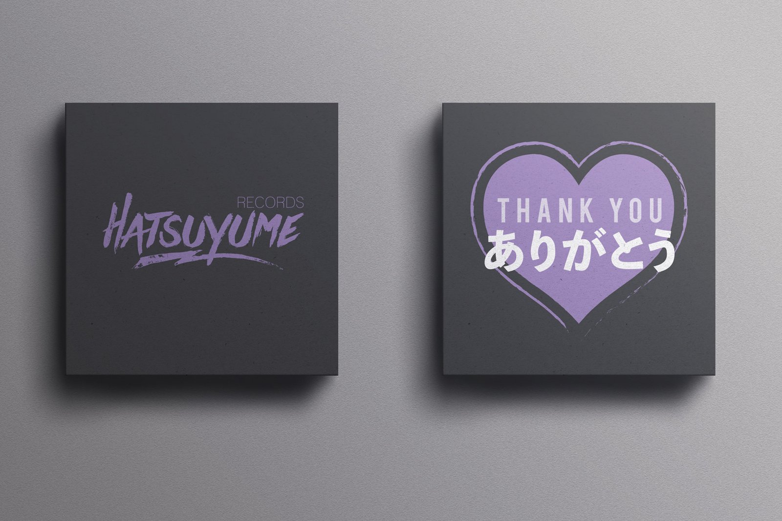
Expressing gratitude can be an art, and with the Hatsuyume Records Label Thank you card, I aimed to infuse every detail with heartfelt appreciation. 

On the front, the company’s logo,  while on the back, a special message awaits. “Arigatou” (ありがとう), Japanese for “Thank you,” is written in Jaanese, symbolizing the depth of gratitude towards those who support the label’s musical journey.

In a subtle yet poignant touch, a heart is nestled alongside the message, representing the love and passion poured into every note, every beat, and every record released by Hatsuyume Records.

With the Hatsuyume Thank you card, giving the gift of music becomes not just an exchange of records, but a heartfelt connection between artist and audience.

04
Merchandise

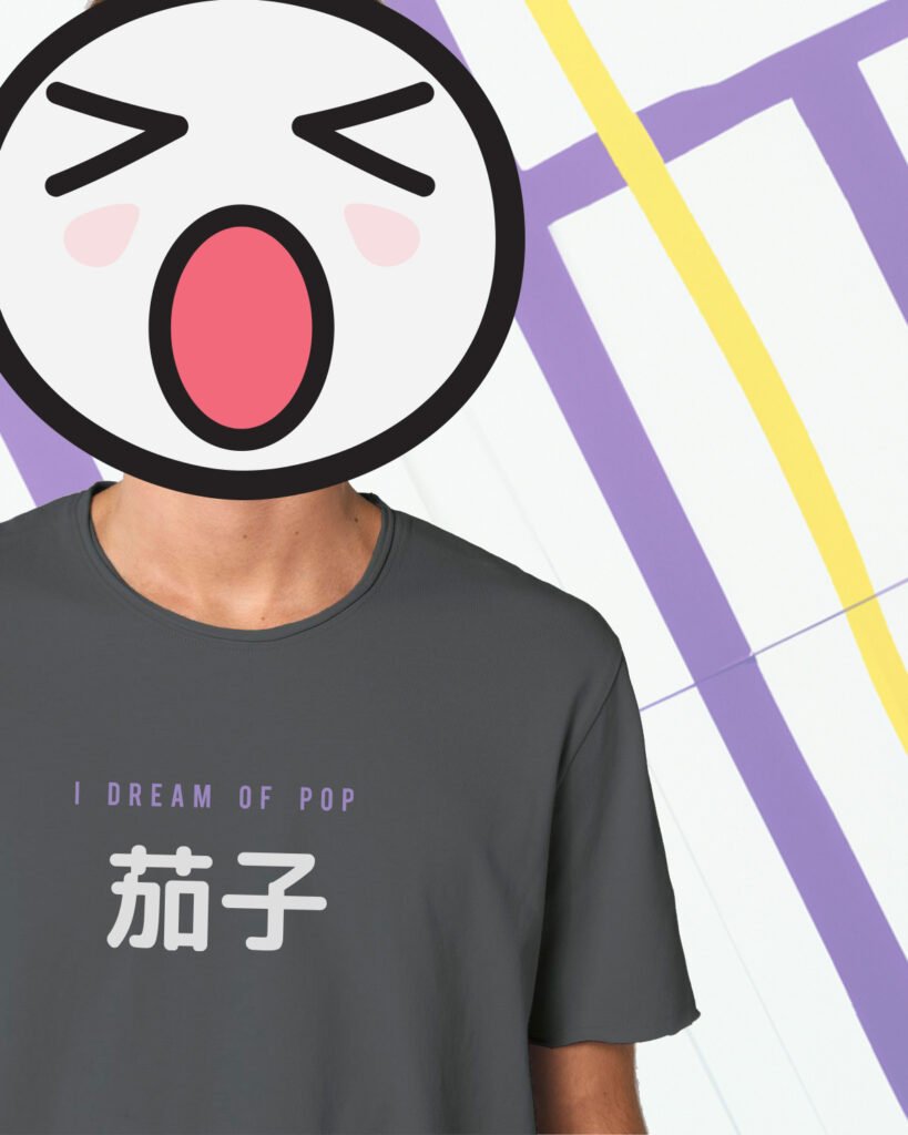
The centerpiece of the merchandise collection is a series of three T-shirts, each adorned with one of the label’s iconic slogans: “I dream of pop eggplant,” “I dream of ambient hawk,” and “I dream of New Wave Mount Fuji.” These slogans, infused with whimsy and meaning, not only pay homage to the three lucky dreams of Japan but also celebrate the diverse musical genres embraced by Hatsuyume Records.

Rendered in the serene palette of grey and light purple, derived from the label’s logo, the T-shirts exude a sense of understated minimalism, making them versatile additions to any wardrobe. Whether worn alone or layered, they serve as a stylish expression of one’s love for music and dreams.

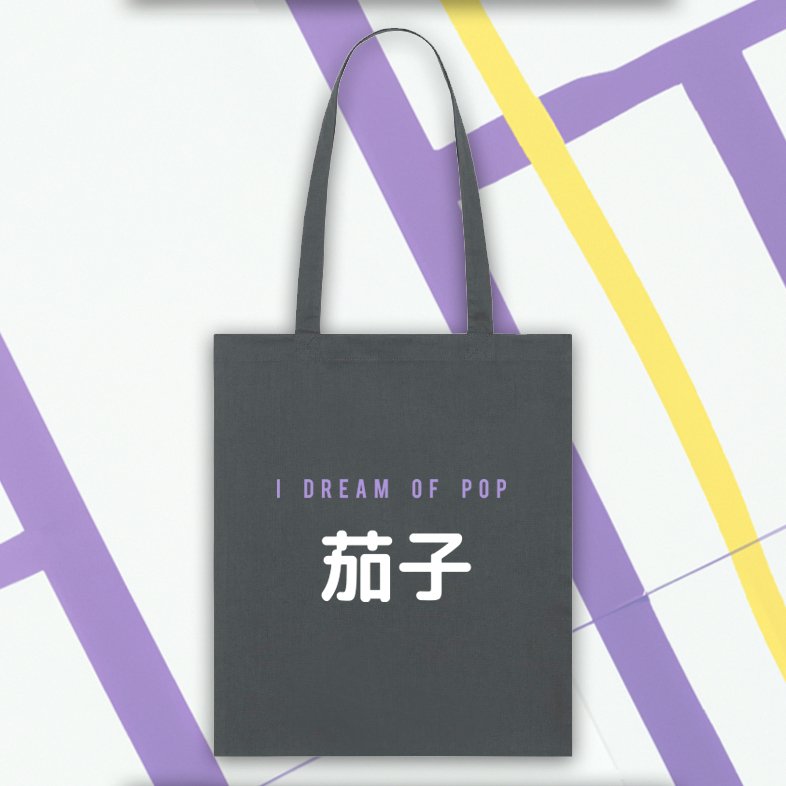
Complementing the T-shirts is a chic tote bag featuring the main slogan, “I dream of pop eggplant,” elegantly screen printed on the front. Perfect for carrying records, notebooks, or everyday essentials, the tote embodies the label’s commitment to both style and practicality.

05
Website

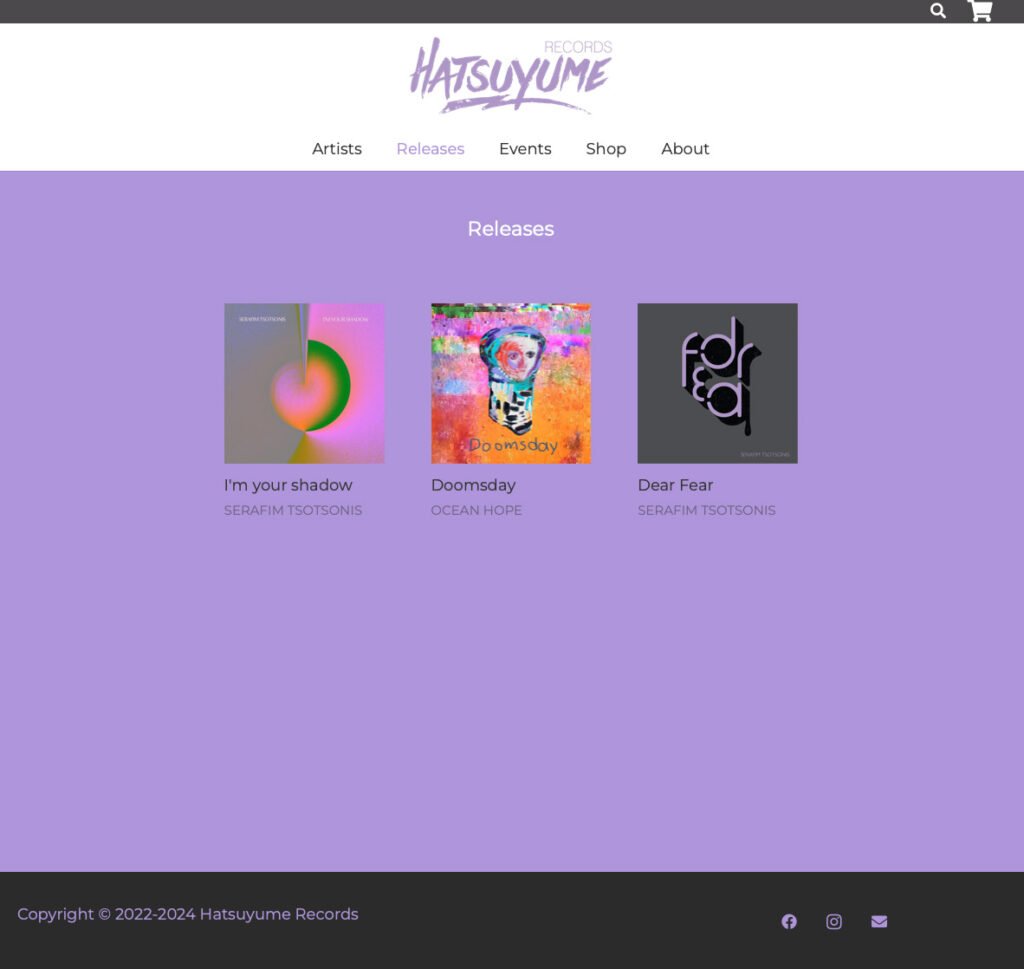
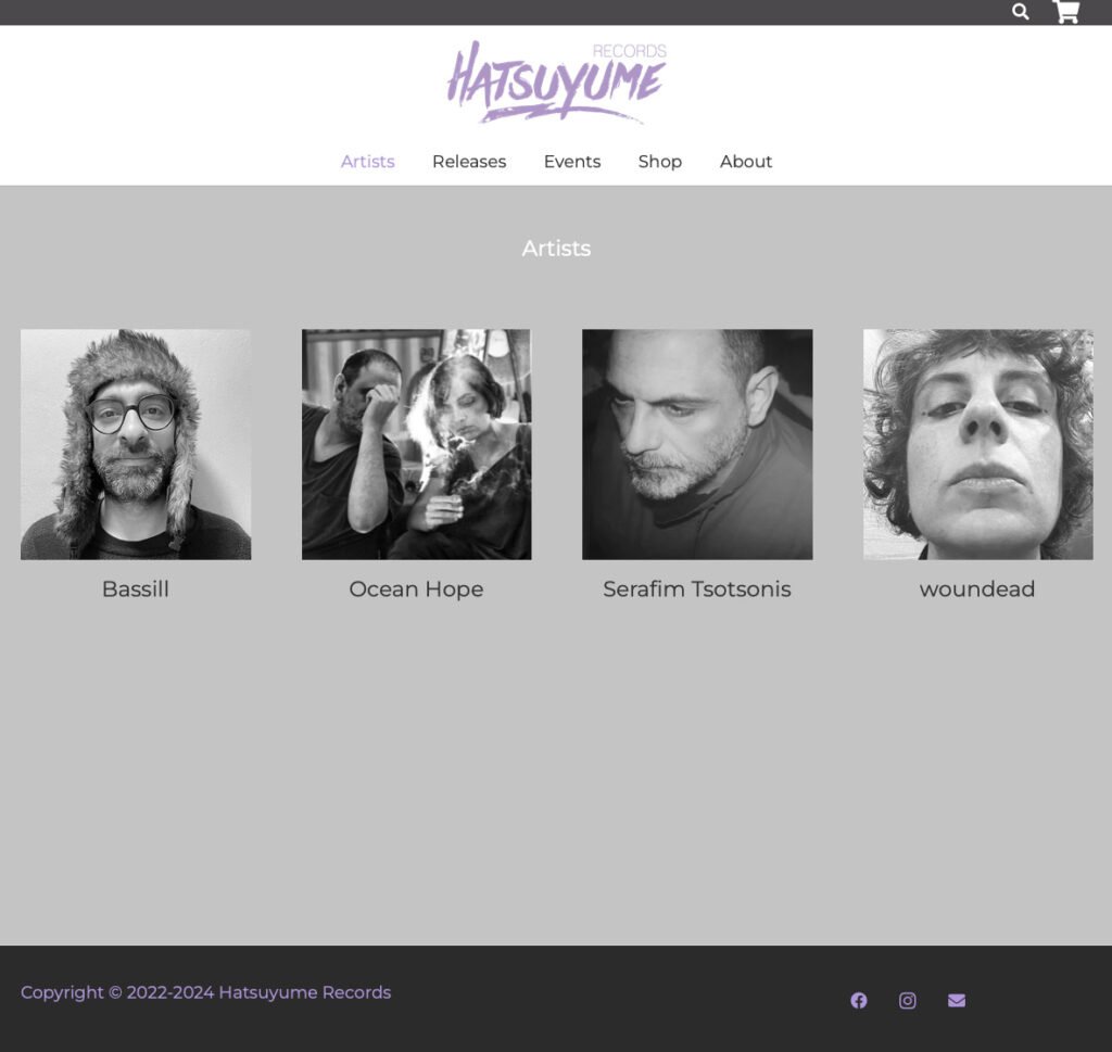
In designing the website for Hatsuyume Records Label, simplicity and minimalism were paramount. Drawing inspiration from the label’s logo, characterized by a soothing palette of grey and light purple, the website serves as a digital sanctuary for music enthusiasts.

Embracing a minimalist aesthetic, the design allows the music to take center stage, with clean lines and uncluttered layouts guiding visitors through a seamless browsing experience. Each element is carefully curated to evoke a sense of calm and sophistication, mirroring the refined taste and independent spirit of Hatsuyume Records.

The grey and light purple color palette, echoing the hues of the logo, lends a sense of harmony and continuity throughout the website, tying together every page and creating a cohesive brand identity.

https://hatsuyumerecords.com/